A day or two ago, I read a comment chiding a news outlet’s coverage of the BP spill for its seeming fixation on numbers–that is, how much oil, exactly, is leaking. Obviously, figures matter. Gallons matter. But the commenter’s sentiment also rang true; making numbers into the news distracts from what we already know: This spill is enormous. And can the average person visualize the difference between 10,000 and 100,000 gallons anyhow?
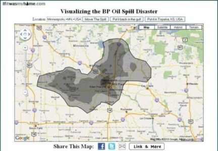
I can’t. But Andy Lintner, a Michigan-based software developer, has made an interactive website that (quite literally) brings the BP oil spill home. At If It Was My Home, type in a location–and with a little help from Google Maps–you can see the sprawling BP oil slick overlaid on your hometown or anywhere else in the world. The image above is a screenshot of the Twin Cities.
“I was shocked at how big it actually was,” Lintner told the Tornoto Star. “People can’t comprehend the size.”
Source: If It Was My Home, Toronto Star


