If I’m wearing a jacket, is the earth really warming?
Most of the United States had a notably cool summer and fall, a phenomenon that plenty of climate-change skeptics have seized upon. “Nice global warming we’re having,” they’ve been saying for months as extraordinarily cool temperatures have prevailed. So it looks like it’s time for another enlightening discussion of the elemental difference between weather and climate–with infographics!
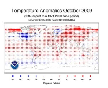
Let’s look at the most recent month, October. The National Climatic Data Center recently released a map of October’s global temperature anomalies in one of its State of the Climate reports. Blue dots show cooler-than-average temperatures; red dots show higher-than-average temps. The bigger the dot, the greater the departure from average. As you can see, the U.S. is an island of blue in a world that is virtually red:
Also see maps from June, July, August, and September–as well as the combined June-August period–at the NCDC website. To varying degrees, they show the same thing: The United States has been one of the coolest places on the planet, relative to average, for months.
So the next time you hear a denialist–or just your well-meaning friend who’s clumsily trying to make small talk about the weather–attempt to link climate change and the current temperature outside your door, don’t just shake it off. Remind them that as usual, the big picture is what counts. And yes, it’s still getting warmer out there.
Source: National Climatic Data Center
Image courtesy of National Climatic Data Center.


